
Believe it or not, colour plays a huge role in how your restaurant is perceived. Even before stepping foot onto your premises, because of colour, customers will have already formed an impression of your brand based on the colours used.
Choosing the right colour is just as essential as picking the right lightning and even the right chef!
Pick-A-Palette
If you are at the stage of designing your restaurant then picking colours is a serious decision. The more effectively you do this, the more chance of greater long term success. This is largely due to the fact that the right colour can either make customers feel very energised to very relaxed. It can make a large space feel intimate. It determines the level of intimacy.
It makes utter sense to understand how colours work in the restaurant sector.
It’s not a case of just picking a colour, there’s also the intensity of your chosen colour too. How bold and vivid do you want that blue to really be?
Don’t let all this overwhelm you as no matter what colour rules there are out there, when it comes to your brand, don’t be too afraid to experiment a little.

Tips On Tones
Although we just said experiment with colour, there are a few things to keep in mind.
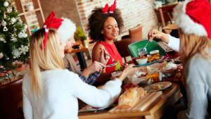
Reds
Whilst this colour provokes hunger it is also widely associated with fast food places. So, unless you are indeed fast food joint, you may want to carefully consider this colour. It turns out the brighter the red the more hurried customers feel. It raises heart rate. It excites. Not one to use if you are wanting to create a calming environment.
That said, if red really is for you, deep reds with hits of orange and browns will create a more earthy and slower paced setting.
If you really must use reds then use it sparingly. Think tablecloths. It has been found that red tablecloths makes customers eat more.
Greens
Greens are great for portraying freshness and healthy options but work less well in drinking bars and places with little natural light.
Using greens with earthy tones can convey a healthy way of eating so think twice about this combination if your establishment offers lots of meat based dishes.
Greens with oranges will give a fresh, crisp, lightness feel to a place so this combination would do well for eateries offering organic, natural dishes.
Browns
Browns are best for fine dining places. Used with deep reds and dark colours give an air of elegance. These colours invite diners to stay and take their time over a meal.
Oranges and Yellows
These two colours always portray happiness and cheerfulness. Yet mixed with blacks and browns can create something of a more formal dining experience.
Again, as with greens, oranges and yellows are rarely used in restaurants which offer a lot of meat dishes. They can found more in places offering breakfast or brunch options.
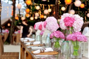
Blues and purples
These two colours are an odd couple as they don’t really scream ‘come and eat’. Other than blueberries, blues aren’t naturally found in things we eat. Blues don’t even make food appealing to eat. This might explain why there aren’t many blue themed restaurants.
Purples give a fun element to a place. Again, depending on the shade, purple can either give an air of elegance or playful.
Whites, Neutrals and Greys
These types of colours are clean and crisp. They make the smallest of spaces feel roomier. So if your restaurant is on the cosier side of things then think about this group of colours to help give the impression of space.

White is synonymous with purity and cleanliness. This colour gives a feeling of sophistication when teamed with black. But it can also conjure up a clinical feel if teamed with silver or metallics. Whites, neutrals and greys are great as secondary or accent colours if you’re concerned that too much of this group will be bland.
Perfect Blend
At the end of the day there is no set rule for picking colours for your restaurant. If your restaurant is a lively place; use bright colours. If your restaurant is a relaxing place; use warmer, more mute tones.
It’s all comes down to balance and understanding how colours work. Use them to work for you.
Hanh Harper
Branding specialist and crisp hoarder